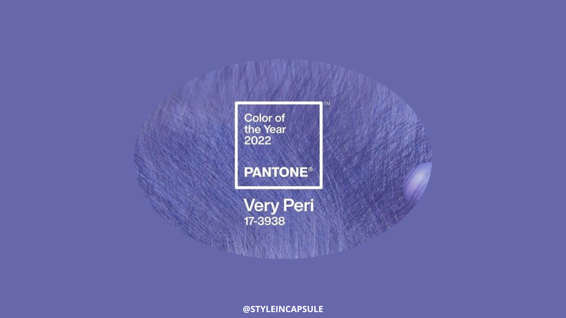
The new year 2022 will be colored by the new Pantone Very Pery 17-3938. “Very Peri”represents the fusion of the trends in gaming, the metaverse and modernity and encourages courageous creativity and imaginative expression. Let’s discover the season of belonging of this color and whom it suits the best according to the color analysis.
CHROMATIC CHARACTERISTICS OF VERY PERI
Each color has specific chromatic characteristics, like all color seasons and all individuals. Very Peri is a periwinkle blue color with a medium-light value, medium-high intensity and a medium-warm (violet-red) undertone. The color season that has the same chromatic characteristics is the Spring Season. Very Peri works perfectly with all the colors from the Spring palette because it reflects the Spring season. It enhances all its subgroups, and it is especially beautiful on individuals with natural red hair, such as the actress Jessica Chastain because it exalts her chromatic features: the medium-light value, the medium-bright intensity and mostly her dominant chromatic characteristic, the “warmth”. If you are not part of this season, you can always use Very Peri combined with a color from your palette. Here is a guide for all four season groups on how to pair this color to create enhancing combinations for your skin undertone, which is the most important feature to highlight.

Picture from Pinterest

THE WINTER COLOR SEASON
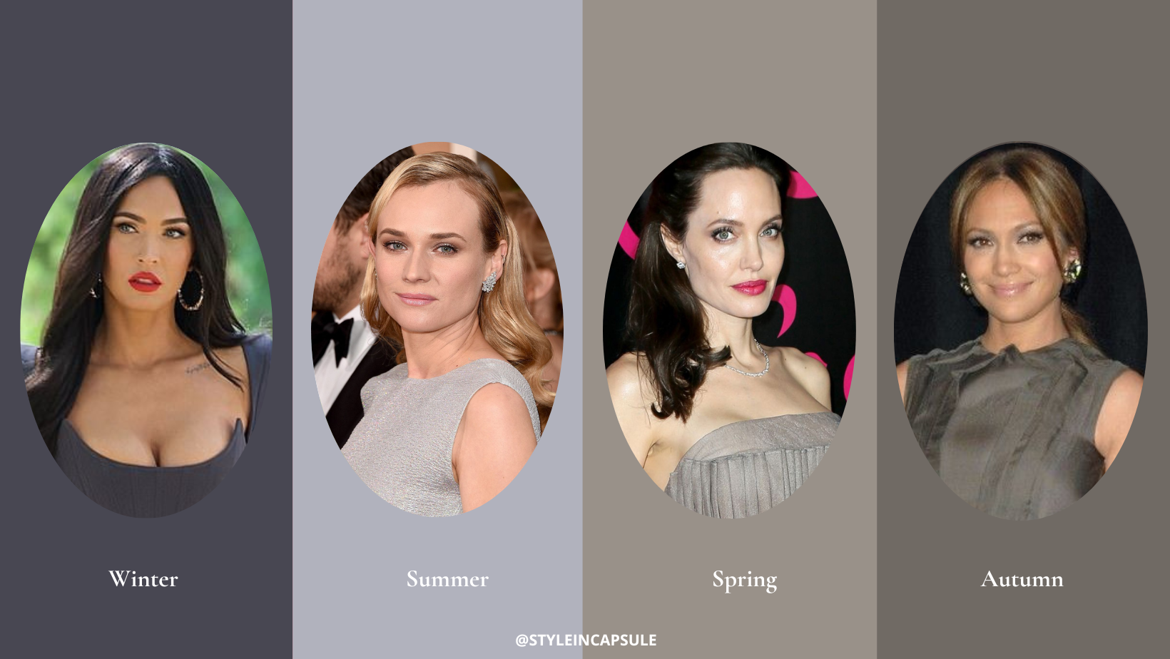
The winter and the spring season share the aspect of “Brightness”. They have different temperatures and different values. Based on what subgroup the winter palette person belongs to, she/he will need cool, deep or bright colors to bring out her/his coloring.
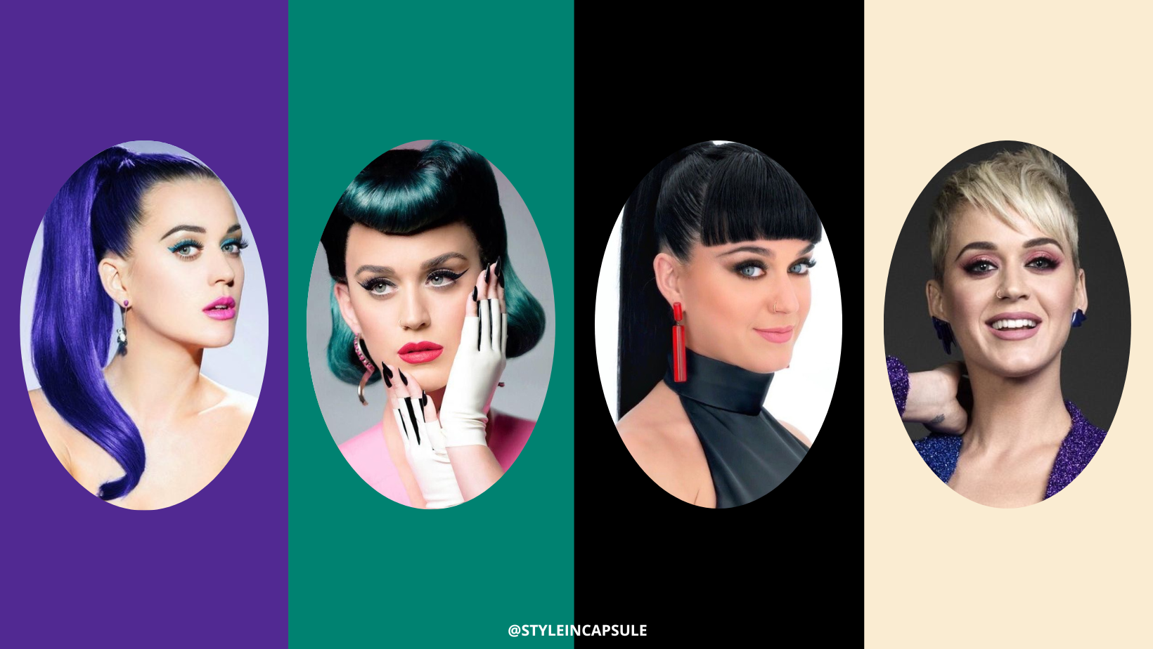
If you are a “Winter Bright” palette person, you can combine Very Peri with a cool shade of violet, the Pantone Ultra Violet or with whatever “bright” color from your “winter bright” palette.
If your dominant chromatic aspect is the “coolness”, hence you are a “Winter Cool” subgroup, you can match Very Peri to a cool blue color, Pantone Skydiver or to another color that has the “coolness” as a dominant aspect.
The“Winter Deep” palette person needs deep colors to bring out the chromatic characteristics present in her/his personal color palette. You can pair Very Peri with black color, Pantone Black Beauty, if you are in this subgroup. It can also work with your palette’s other “deep” colors.
When using a color that is not part of your palette, you can apply two strategies: the first one is to pair that color always with a color from your palette that brings out your coloring the most. The colors that bring out your coloring the most if you are a subgroup with a dominant aspect are the ones that highlight and support your dominant aspect. The second strategy is to use the colors from your palette on top to enhance your natural coloring. Use the colors from other seasons on the bottom, far away from the undertone on the face, if they are too disharmonious for your complexion. In that way, they can’t influence your complexion.
The “Winter True” palette person doesn’t have a dominant aspect in her/his coloring, so she/he can choose to combine Very Peri with whatever color from the “winter true” palette; they all suit her/his chromatic characteristics perfectly.

THE SPRING COLOR SEASON
The chromatic characteristics of Very Peri work very well with the Spring Palette individuals. This color enhances all the subgroups, and the color combinations that can be created with it are limitless because Very Peri works with all the colors from the Spring palette.
If you are a spring palette person, you can create monochromatic outfits with Very Peri. Or you can combine Very Peri with a warm shade of green, Pantone Spring Bouquet if you are a “Spring Bright” subgroup. Your palette’s other “bright” colors can work perfectly with Very Peri.
The “Spring Light” palette person needs light colors to highlight her/his dominant aspect, the “lightness”. You can combine your jolly color Pantone Turquoise with Very Peri; together, they create an enhancing color combo for your chromatic characteristics. Or you can choose whatever color that has as a dominant aspect the “lightness”.
If you are a “Spring Warm” subgroup, you can pair Very Peri with Pantone Apricot to bring out your dominant chromatic aspect, the “warmth”.
The “Spring True” subgroup doesn’t have a dominant color aspect; it can use whatever color from its palette to create color combos with Very Peri.

THE SUMMER COLOR SEASON
The spring season shares with the summer season the value of the colors; that’s why both seasons are enhanced by light and medium-light colors. These seasons have different temperatures and different intensities. The summer season is a cool season with soft intensity, while the spring season is a warm season with bright chroma. Based on the subgroup of belonging, the summer palette person needs light, soft or cool colors to bring out her/his coloring.
If you are a “Summer Cool” subgroup, you can pair Very Peri with a blue color, Pantone Little Boy Blue, and with all the colors from your palette that contain a high amount of blue hue on their inside, hence extremely cold colors.
The “Summer Light” subgroup needs light colors to highlight her dominant aspect. You can combine the year’s color with a green color, Pantone Polynya, or with all the colors from your palette that are particularly light to support your dominant chromatic aspect.
If you are a “Summer Soft” palette person, you can create a color combo with Very Peri and a light grey color, Pantone Ultimate Gray, or with all the colors from your palette that are mostly soft. The most important when creating color combos with colors that are not from your palette is to choose the colors from your palette that highlight your dominant chromatic aspect.
The “Summer True” subgroup can choose whatever color from the “summer true” palette because it doesn’t have a dominant chromatic aspect.

THE AUTUMN COLOR SEASON
The spring and the autumn color season have only the warm temperature in common. The spring season has bright intensity and light value, while the autumn season has soft intensity and dark value. The autumn palette person, based on its subgroup, will need mostly warm, soft or deep colors to enhance its coloring. Choose always the ones that bring out your dominant aspect the most.
If you are an “Autumn Warm” subgroup, you can combine Very Peri with a warm, spicy red color such as Aurora Red and with all the particularly “warm” colors from your palette.
If you are an “Autumn Deep” subgroup, you can pair Very Peri with a teal color such as Pantone Mosaic Blue or whatever deep color from your palette.
The “Autumn Soft” subgroup needs soft colors to be enhanced the most. Pantone Toffee will work perfectly with Very Peri. Or you can choose other soft colors just like the dominant aspect of this subgroup if you are an “autumn soft” palette person.
The “Autumn True” palette person can choose whatever color from the “autumn true palette” because it doesn’t have a dominant aspect.

Color analysis is an excellent tool for learning about your colorimetry, colors and their characteristics. It focuses on your chromatic characteristics and tells you which colors compliment your personal color palette manifested in your skin, eyes and hair. The proper selection of colors can change your entire image because colors have a lifting power on your appearance and are part of your beauty. And thanks to the color analysis, you can also learn how to use colors as a body strategy based on what you desire to achieve with your look.
Want to learn more about color analysis and colors? Follow us on Pinterest where you can find a board for each season with reference stars and with a collection of outfits “in palette”.