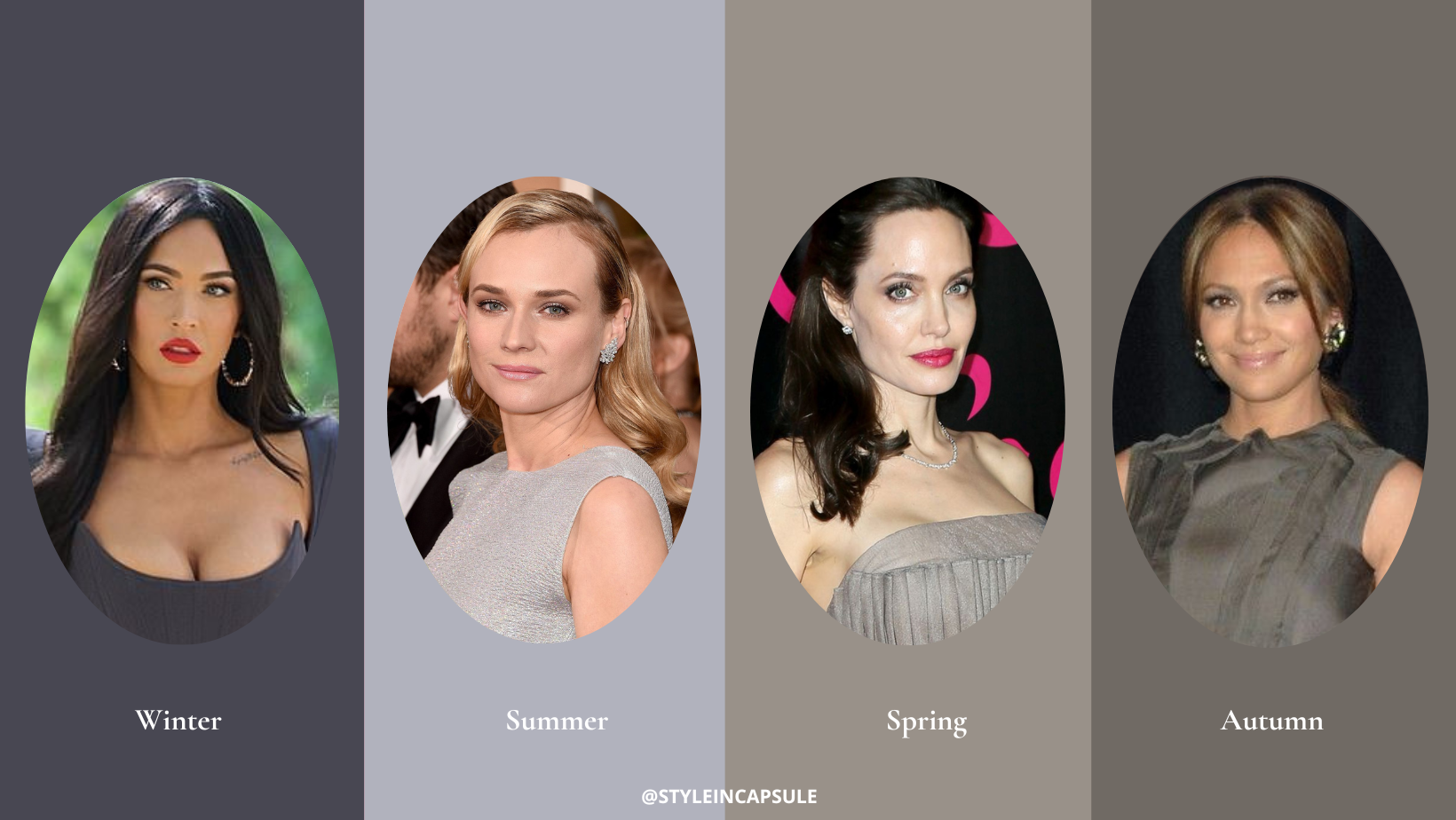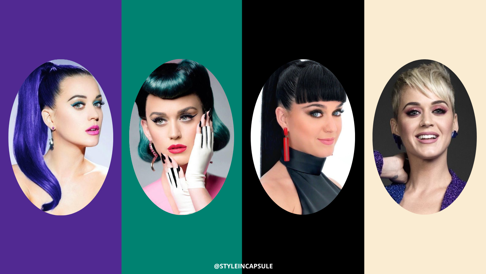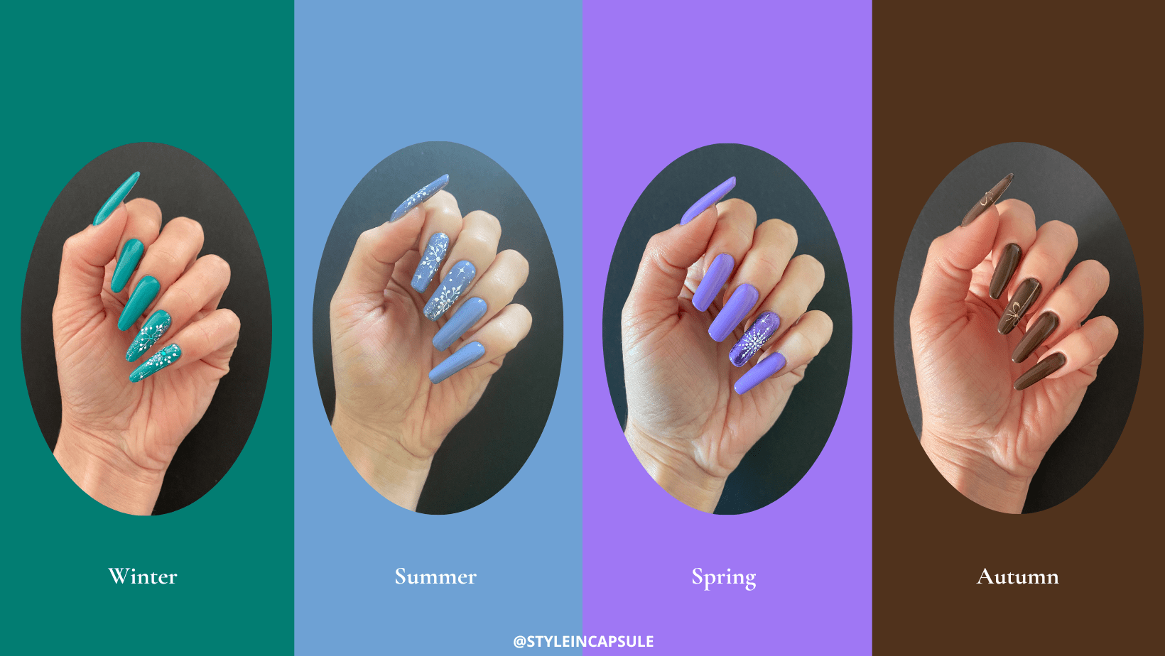
The most awaited moment for all creatives working in the image consulting industry is the unveiling of Pantone’s Color of the year. Being knowledgeable about the color of the year has a lot of benefits. Here at Style in Capsule Studio It’s our favorite moment of the year for two reasons. First of all, because Pantone with their annual proposal of color of the year can help you rediscover some colors that maybe you’ve never considered before and second because it expands your color knowledge.
Each color has its own chromatic characteristics, belongs to a specific color season and suits individuals that have the same chromatic characteristics as those present in the color itself. Knowing the season of belonging of colors allows you to use them to valorize your natural coloring and create the perfect “environment” around you. Colors are not only essential for your aesthetic appearance but also for your surrounding environment. As a surrounding environment, we mean also the colors you use in your interiors, the colors of your social media aesthetics and the colors you use for your personal brand because they can influence your natural coloring. The more knowledge you have about colors the more you can leverage their power and seduction for personal and professional purposes. Once you know your color season and subgroup of belonging you can use your best colors to create harmony which translates in attractiveness because colors are seductive only if they emphasize certain aspects in your natural coloring.
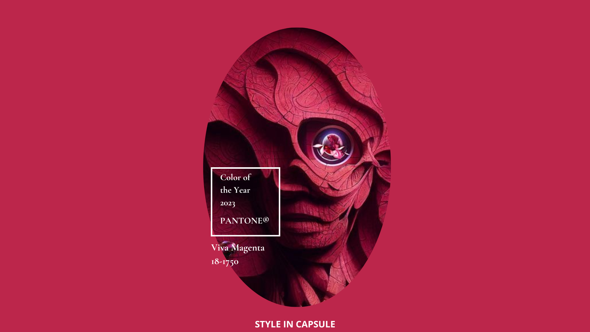
Let’s see how Pantone’s color of the year 2023 Viva Magenta translates into fashion, beauty, interiors and graphic design and whom it suits the best according to the color analysis.
COLOR SEASON OF PANTONE VIVA MAGENTA 18-1750
To get the most out of one specific color the most important is to define what is the season of belonging of a specific color to understand if there is temperature and intensity matching with your coloring.
Viva Magenta is a hybrid color between crimson, purple and pink. It has a medium-cool temperature, and medium-bright intensity and it can only belong to the winter season because it is only the winter season and the winter palette individuals that have these chromatic characteristics. It is important to mention that in Color Analysis there is only a cool and a warm temperature, which means there are no neutral colors and individuals with a neutral undertone. We can only be a warm or a cool palette person or a “borderline type” which still has a temperature and can be medium-warm or medium-cool. The same applies to colors. There are colors that are extremely warm like the orange color or extremely cool like the black color, colors with medium temperature (medium-warm or medium-cool) but also borderline colors. If a color is considered a borderline one that means that is versatile and will suit well not just one particular palette person but more than one.
Viva Magenta has a medium-cool undertone and suits all the subgroups of the winter season but not only. Given the fact that is not extremely cool, there is one subgroup of the autumn season that can handle it too because this subgroup flows into the “winter deep” subgroup and they share the aspect of “depth”. That subgroup is the “autumn deep” subgroup.
A color doesn’t have just one chromatic characteristic. Viva Magenta for example is not just a medium-cool color. It has also other chromatic characteristics that we must take into consideration when analyzing it just like we do when analyzing people. Viva magenta is medium-bright color, with medium-cool undertone and medium-dark value. The “winter deep” and the “autumn deep” share the dominant aspect (the depth), that’s why an “autumn deep” palette person can handle this color in the clothing as well even if Viva Magenta doesn’t have a warm undertone because the temperature of this subgroup is not its dominant aspect. That shows that color harmony is not limiting nor limited because it guides you into a selection of colors that harmonize with your coloring and emphasize your primary color aspect. It suggests you colors not only from your palette but also colors from your sister palette that emphasize mostly the dominant aspect of your coloring.
VIVA MAGENTA IN THE FASHION INDUSTRY
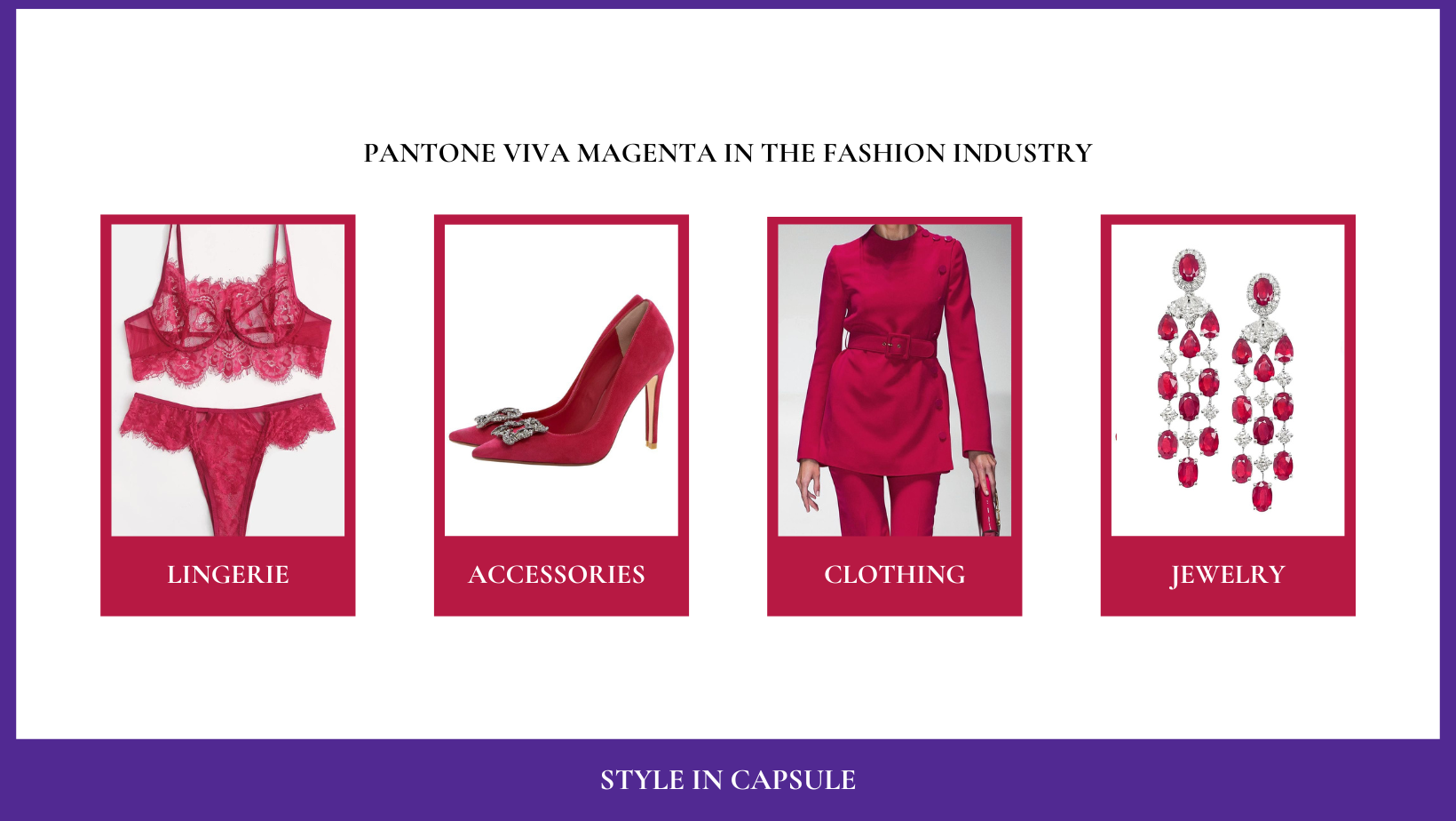
Pictures from Pinterest
Color Analysis is not about following trends and popular colors in a specific period of time but about guiding you into a selection of colors that will always bring out your coloring.
Garments, accessories, lingerie and jewelry of this color are definitely the most valorizing for the winter palette individual. Viva Magenta and winter palette individuals have the same chromatic characteristics, that’s why this color will harmonize with their natural coloring.
It works perfectly with all the colors from the winter palette, so the color combinations you can create are illimited. Here are some ideas for you if you are a winter palette person.
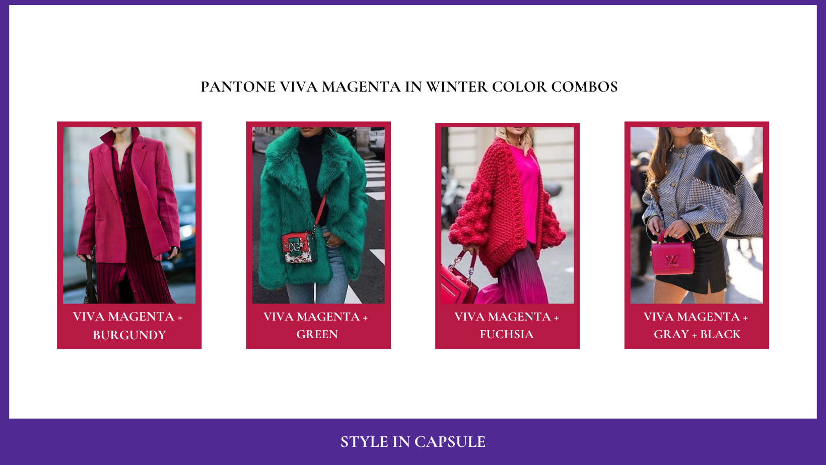
Pictures from Pinterest
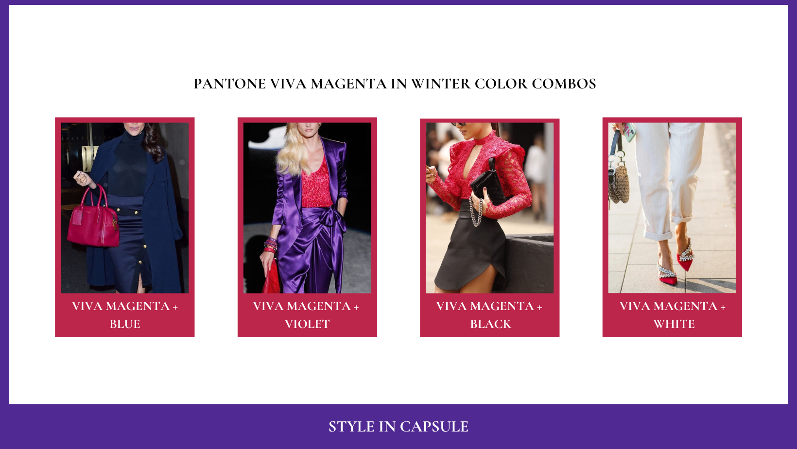
Pictures from Pinterest
If you are not a winter palette person you can use Viva Magenta as well because the color analysis is not about forbidding you certain colors but about teaching you how you can use some colors you like that are from another season.
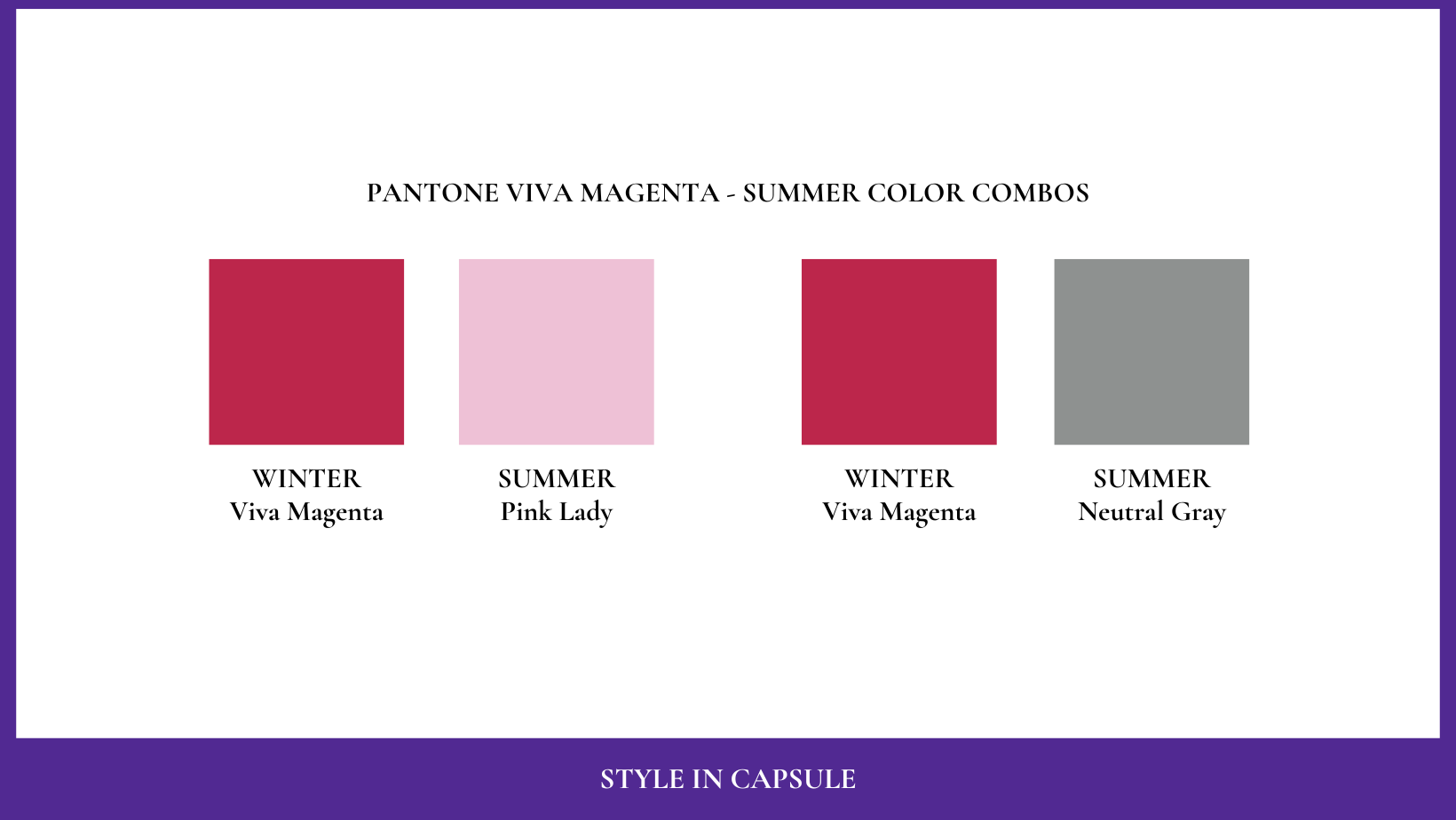
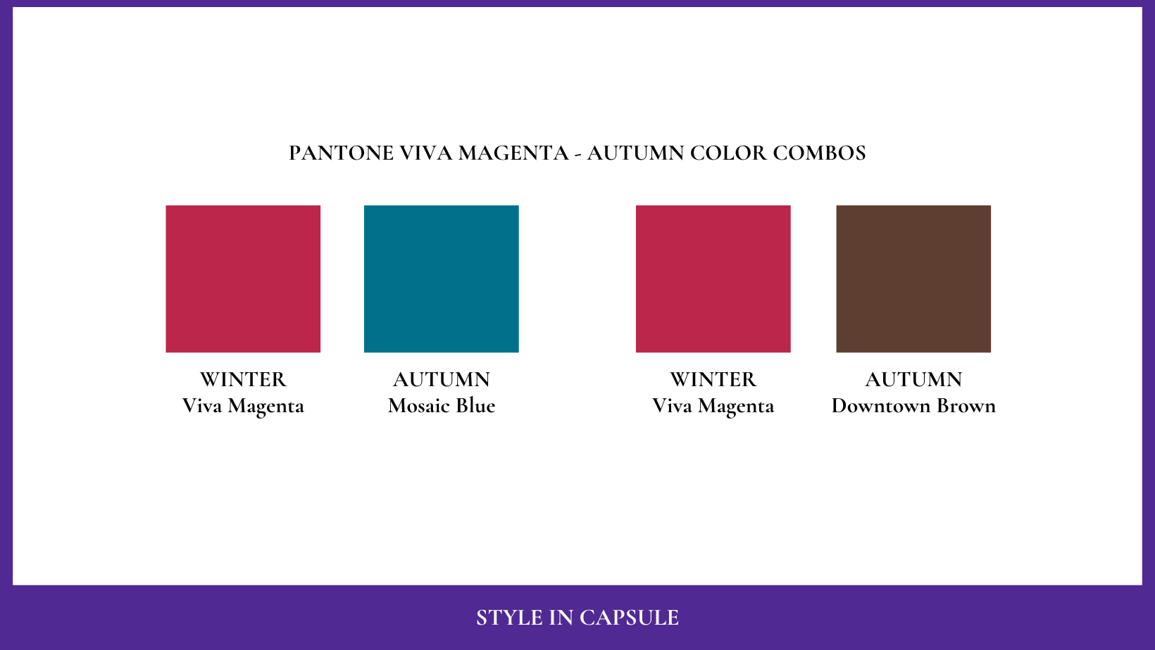
The best way to use a color that is not part of your palette is to combine it with a color from your relative subgroup. Just use your best color on top to enhance your skin complexion and Viva Magenta on the bottom, far away from your face. In that way it cannot influence your coloring.
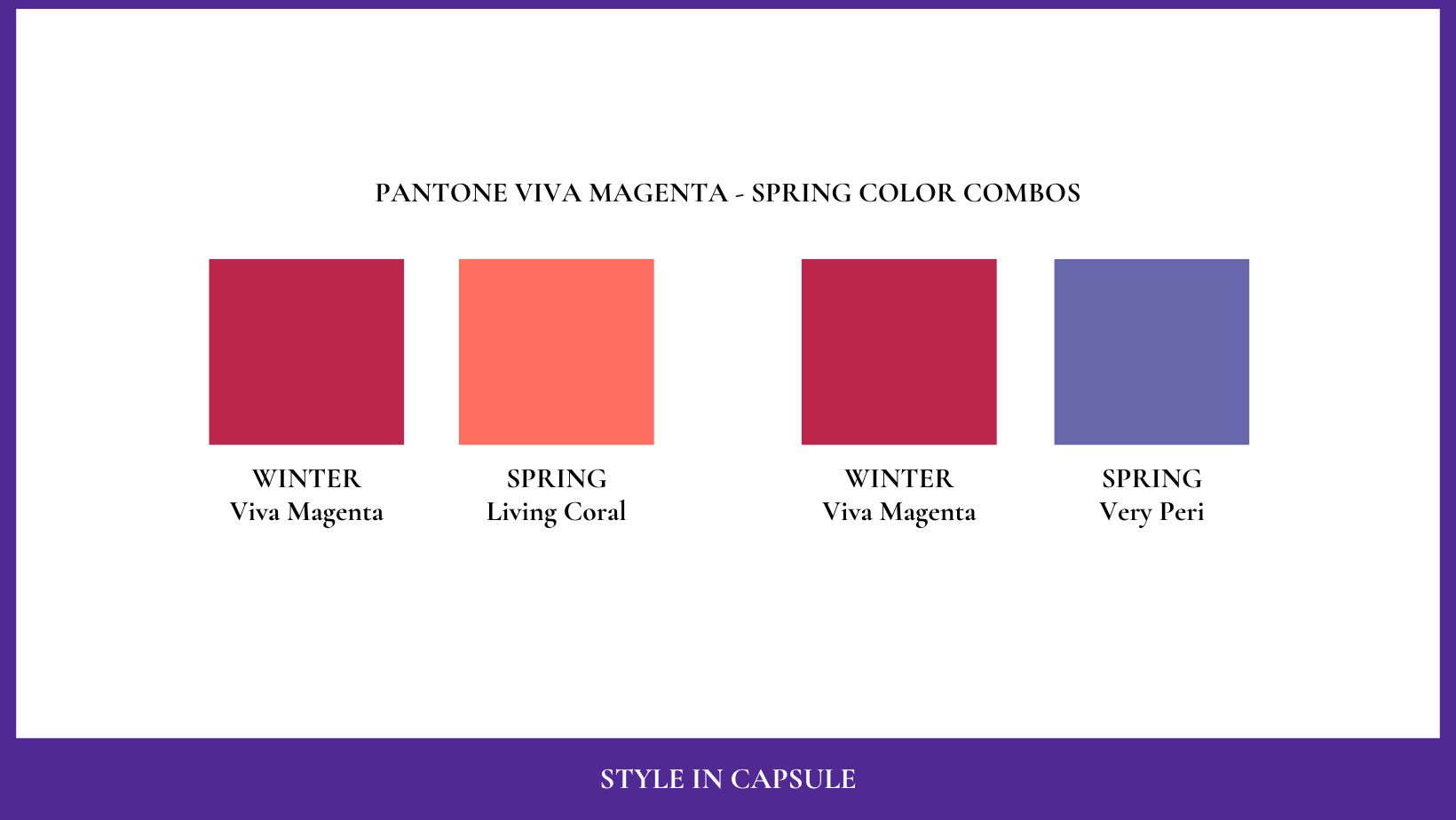
Here are some ideas of color combos for the other three seasons:
SPRING SEASON
SUMMER SEASON
AUTUMN SEASON
VIVA MAGENTA IN THE AESTHETIC INDUSTRY
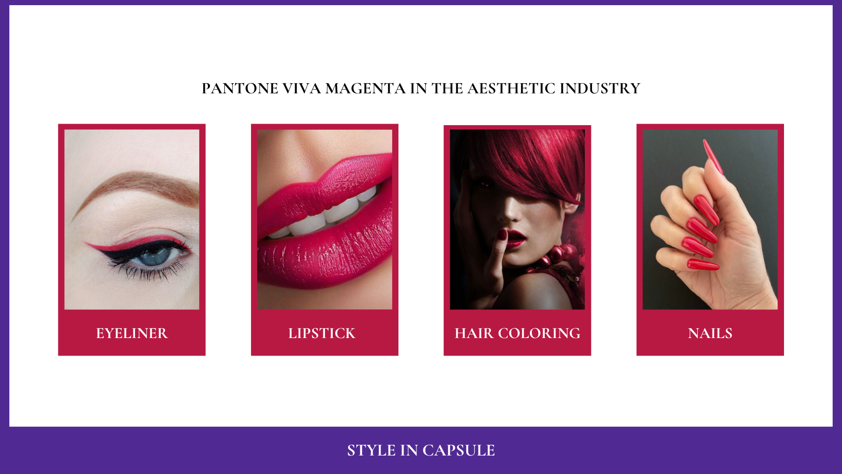
This color is perfect as a color for lipstick for a winter palette person mostly in the winter period when the natural contrast between skin and hair is higher because of the absence of tan. The “spring bright” palette individuals can handle this color as a lipstick as well because they flow into the “winter bright” subgroup and share the aspect of “brightness”. This color can work also for an eye make-up (eyeshadow or eyeliner) if you are a creative/eccentric archetype and if you have green or blue eyes. It is also interesting on brown eyes. The winter palette person has a high contrast in her personal color palette (manifested in the skin complexion, eyes and hair), that’s why she can handle highly contrasting make-ups with this color. Viva Magenta is enhancing also as a color for nails for the winter palette person. As we have said many times the color of the nails is important as well because nails are part of your image and beauty. Viva magenta can be used also as a hair coloring. But the red hair in general (even if Viva Magenta has a cool undertone) is not very valorizing for a winter palette person. That’s why if you want to try it on your hair we recommend using it just on the ends of the hair or only on a few strands, not on the whole hair, because when the red hair coloring fades it becomes orangy. Orange color is the most adverse color for a Winter Palette Person.

Pictures from Pinterest
VIVA MAGENTA IN THE INTERIORS INDUSTRY
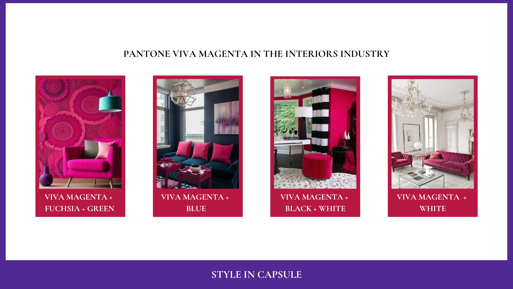
Coloring your interiors with colors from your seasonal palette is the best way to create a valorizing chromatic environment for your image. As “environment” we mean all the surrounding colors you use in the aesthetics of your image as we have seen before but also in your home and office interiors. If you are a winter palette person and you like Viva Magenta you can use it for your furniture or furnishing accessories or as a lacquered wall like pantone proposes on their website. You can combine it with optical white, black, blue or fuchsia and have spaces which colors not only work between them but also with your coloring.
Pictures from Pinterest
VIVA MAGENTA IN THE GRAPHIC DESIGN INDUSTRY
If you are an entrepreneur and you want to build your visual branding or you simply want to create attractive aesthetics on your social media, you can use the colors from your seasonal palette. The colors with the same chromatic characteristics as the ones present in your coloring are the best also for your social and business aesthetics because they are an extension of you. If you are a winter palette individual and if viva magenta reflects also your style and aligns with your business, you can use it in your personal brand color palette.
CONCLUSION
The appearance of your personal colors can change based on the surrounding environment. The presence of adverse colors in your make-up, clothing, accessories, environment, etc, causes your colors to appear differently. Your adverse colors don’t bring out your coloring; they can wash you out, pale you or make you look unhealthy and aged. If you want to learn all about how to use the colors from your subgroup for your wardrobe, beauty, personal brand and interiors visit our shop where you can find sixteen pdf guides, one for each subgroup. Your subgroup’s pdf will teach you everything you should know about your coloring and the most valorizing colors for all situations and contexts according to your chromatic potential.